Project Overview
The Santa Fe Elite Experience was an exclusive, intimate reward for the customer’s top 25 agents. The program was designed not only to recognize top performers but also to deliberately cultivate and strengthen relationships between the agents and the customer’s leadership team, known as hosts. 53 attendees, including the agents, their guests, and the hosts, journeyed to Santa Fe, New Mexico, for the four-day program.
Event Objectives
To deliver an exclusive and intimate program.
To provide an elevated experience to ensure the customer’s top 25 performers were recognized as the best of the best.
To provide an opportunity for the customer’s leadership to deliberately cultivate and grow their relationships with the top performers.
Creative Approach
Theme
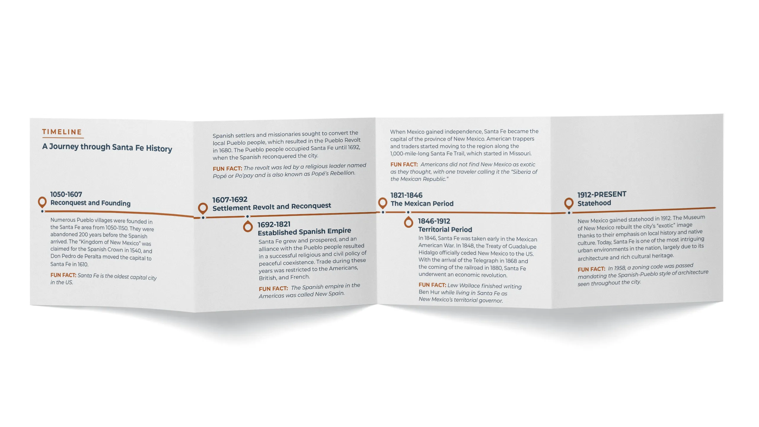
The theme and branding of the Elite Experience centered around the natural beauty and culture of Santa Fe. The goal was not only to generate excitement for the program but also to fully immerse attendees in the destination through the creative deliverables.
Design Elements
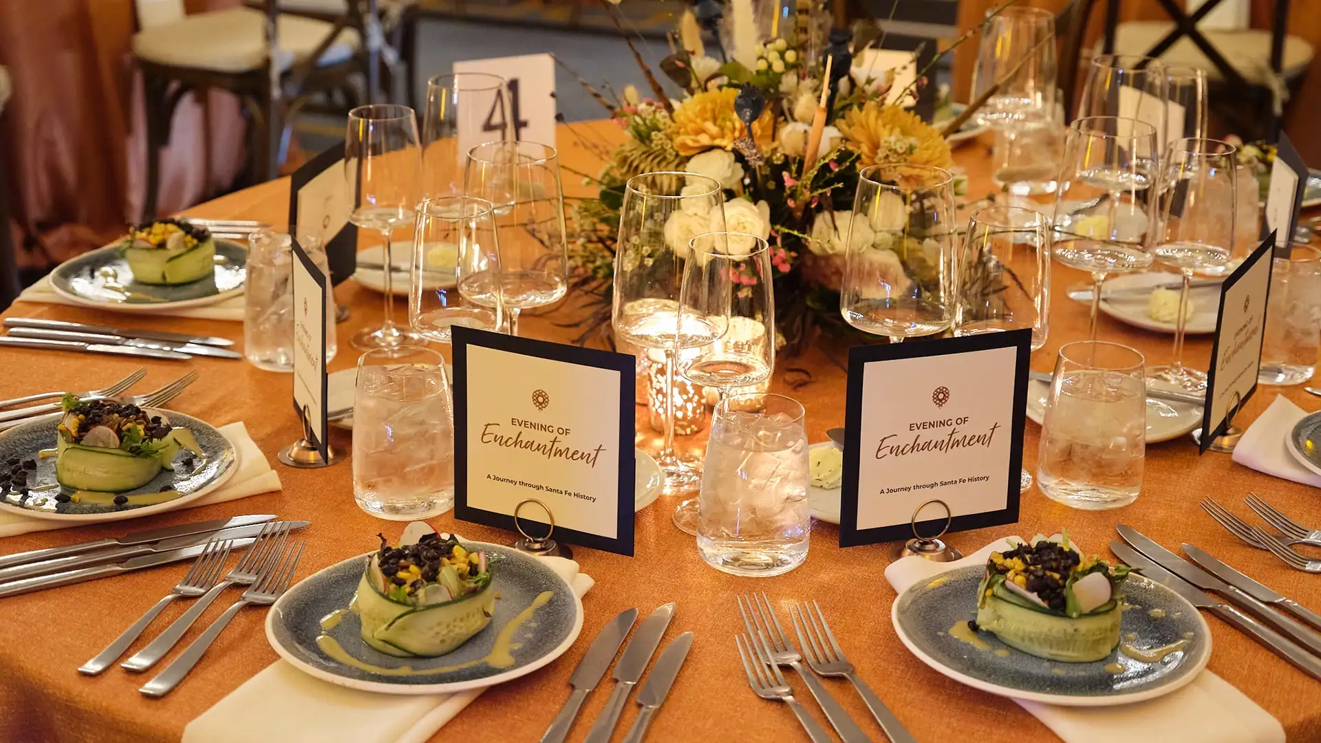
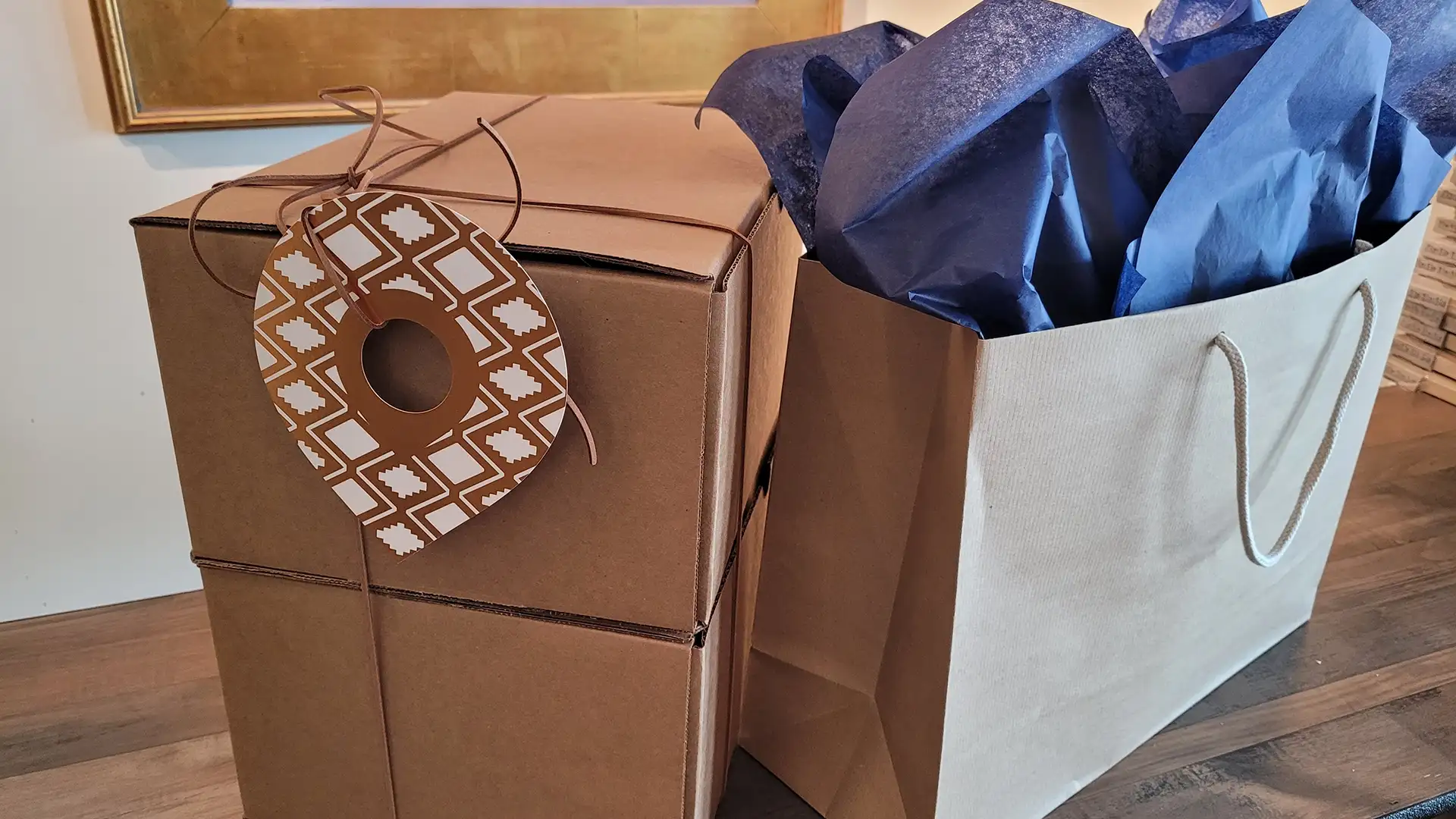
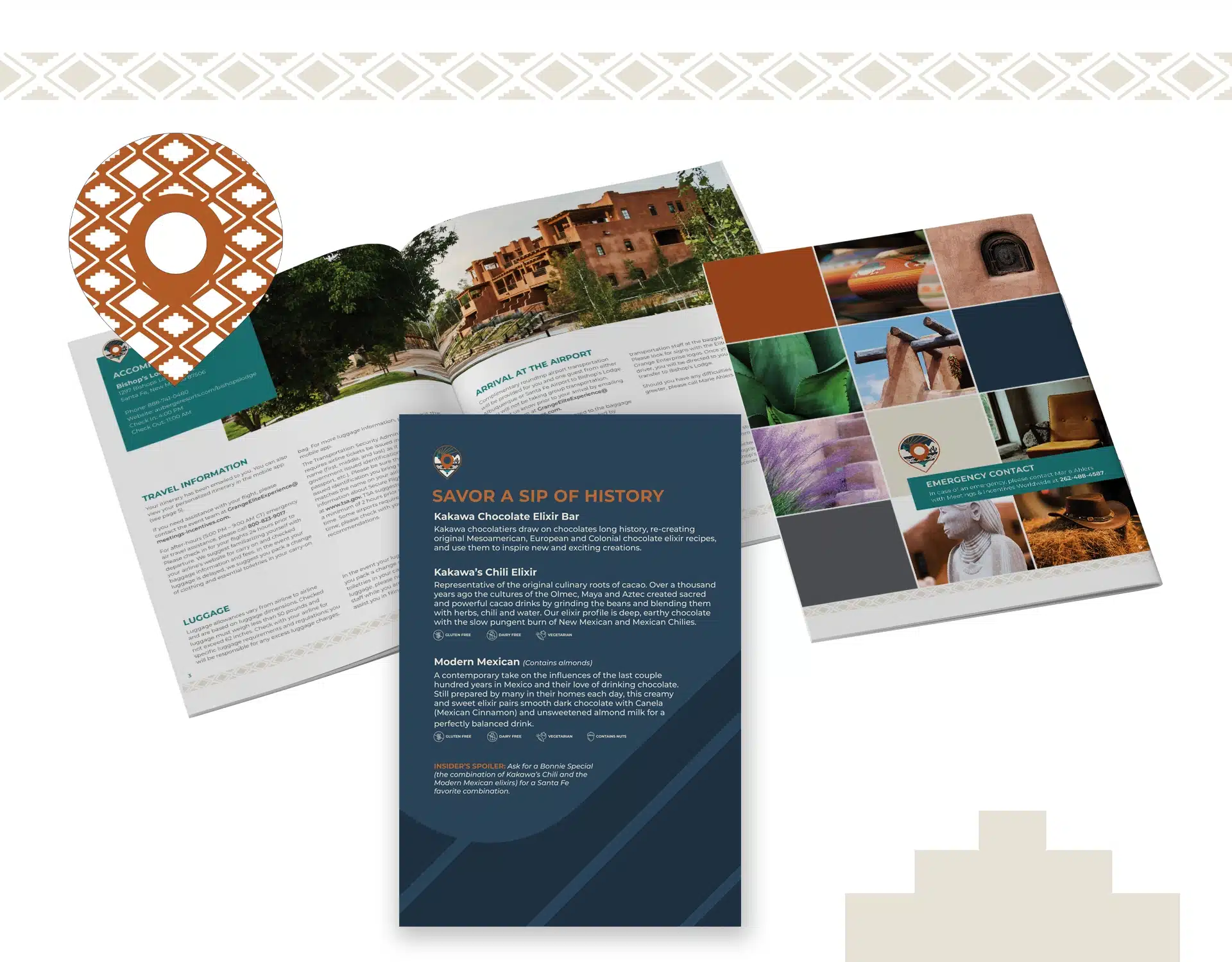
The creative design blended the look and feel of Santa Fe with the high-end luxury expected of an intimate incentive program. This approach kept attendees engaged and contributed to the qualifying agents’ recognition and feeling of accomplishment.
Color Palette
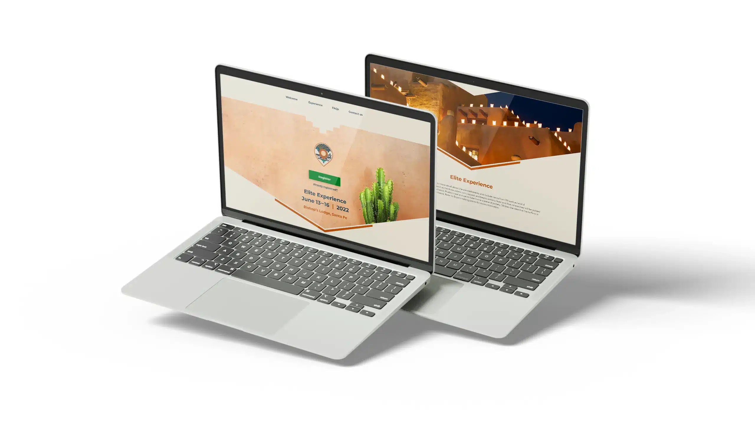
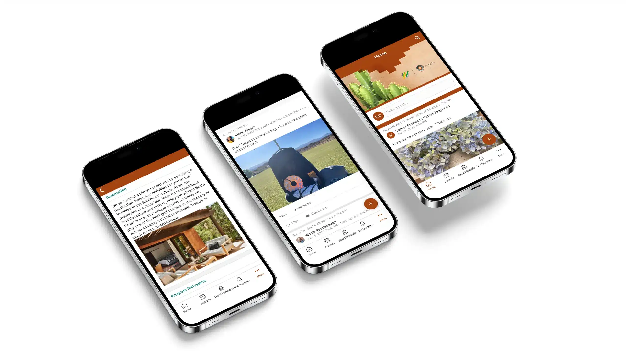
The overall color palette was inspired by the Southwest with turquoise and brown as the primary theme colors. Turquoise was specifically chosen to represent Santa Fe due to the popularity of the stone there.

Graphic Elements
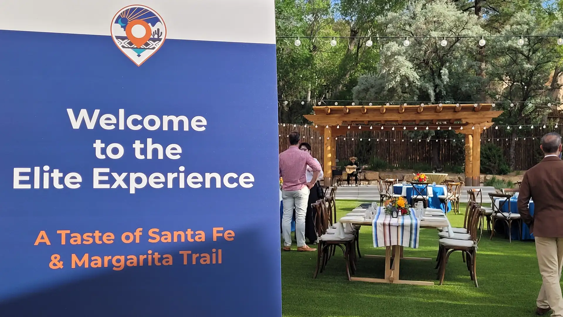
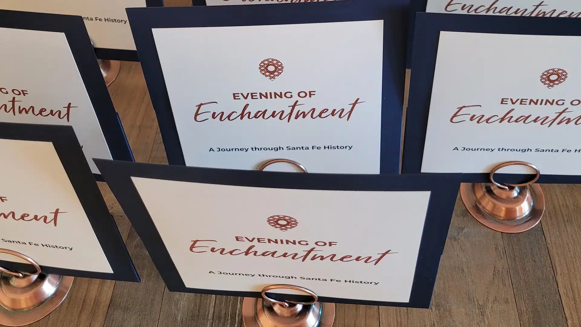
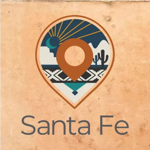
A custom pin drop—like a pin dropped on a digital map—was designed as the program’s logo. The design of the pin drop was created exclusively for Santa Fe with the same turquoise and brown colors, a sun rising over the mountains, cacti, and a native tribal design.
While the Santa Fe Elite Experience was an inaugural event, the customer knew it would be an annual program but with new destinations each year. The ingenious logo allows the program to maintain consistent branding with the pin drop shape but change the inside design to match the destination.
Another distinct element is the use of angled lines, specifically two 45-degree angles coming together at a rounded point. This was inspired by the customer’s brandmark and created a consistent connection between the program branding and the customer’s corporate branding.
Imagery
All photography and visual imagery included scenes of New Mexico to accurately represent the destination. Bright, colorful imagery was specifically used to both generate positive excitement from attendees and to align with the customer’s corporate brand guidelines.

Typography
All deliverables used the customer’s corporate font, Montserrat. Although the program had its own branding guidelines, this consistency established a visual connection with the customer’s organization.
Montserrat Family
Creative Execution
Results
Attendees
